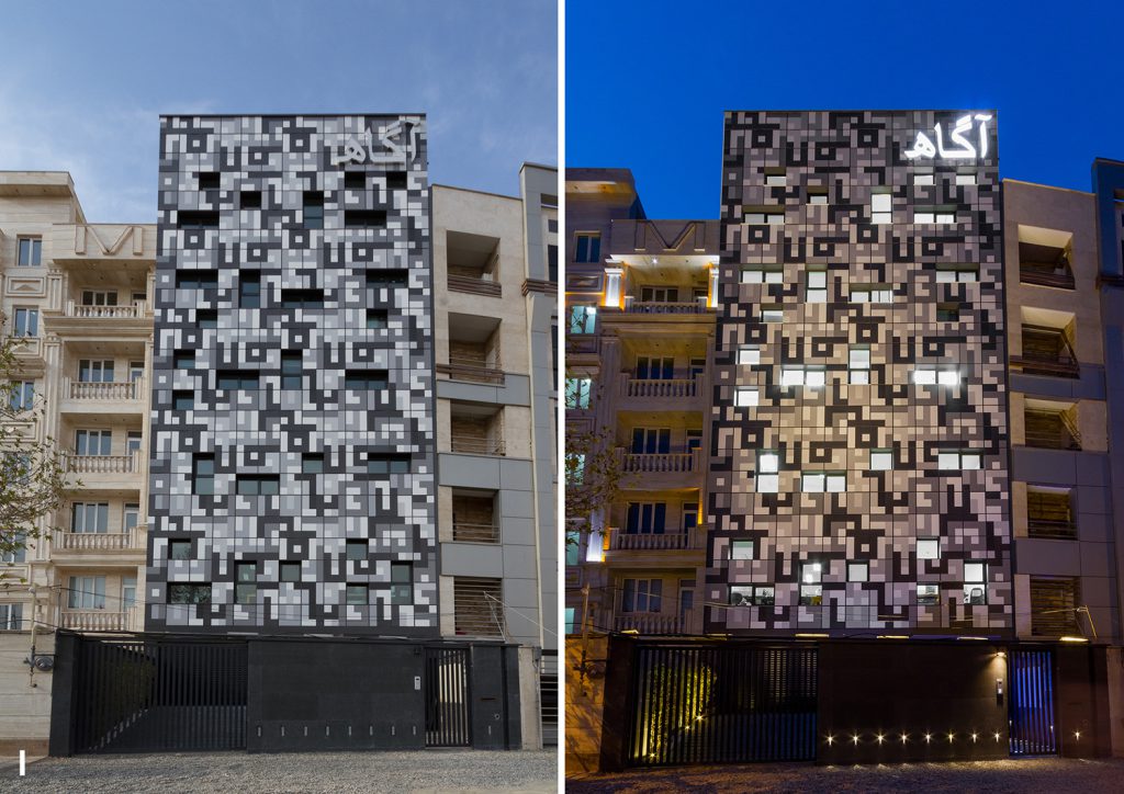
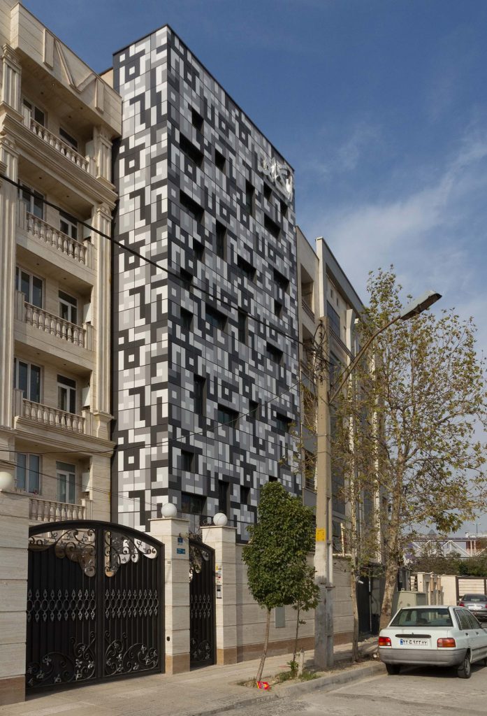
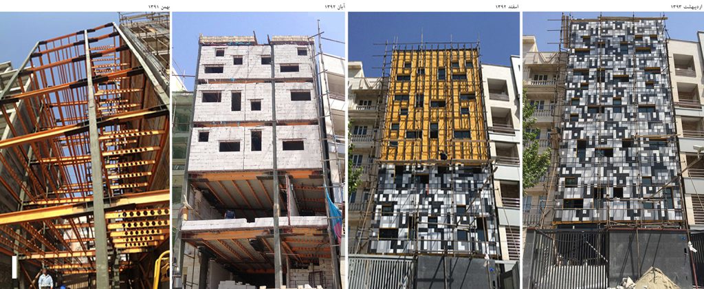
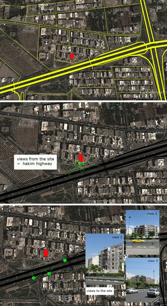
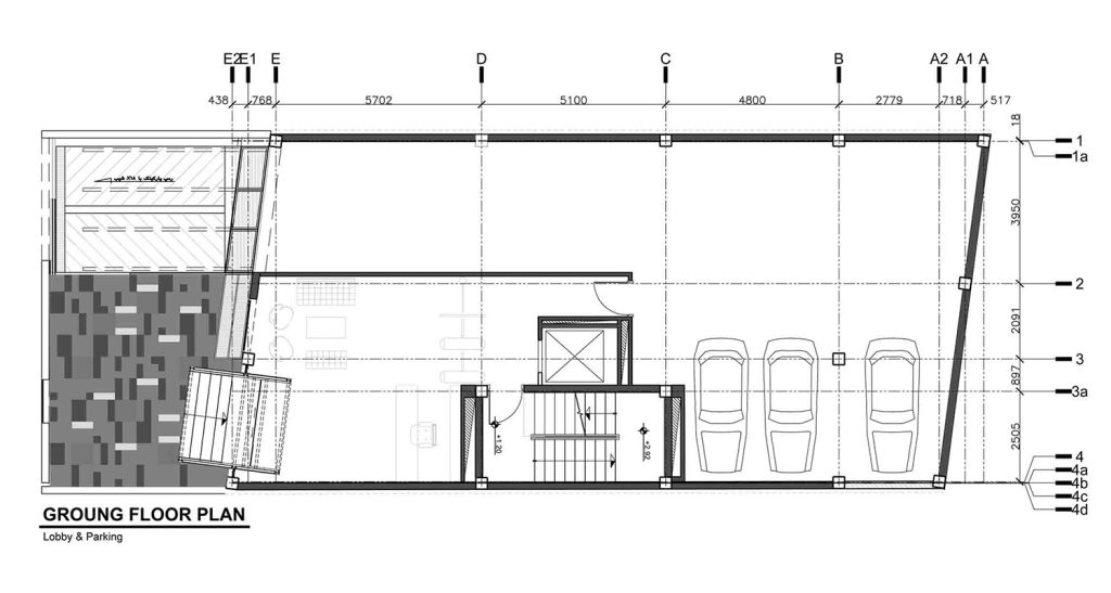
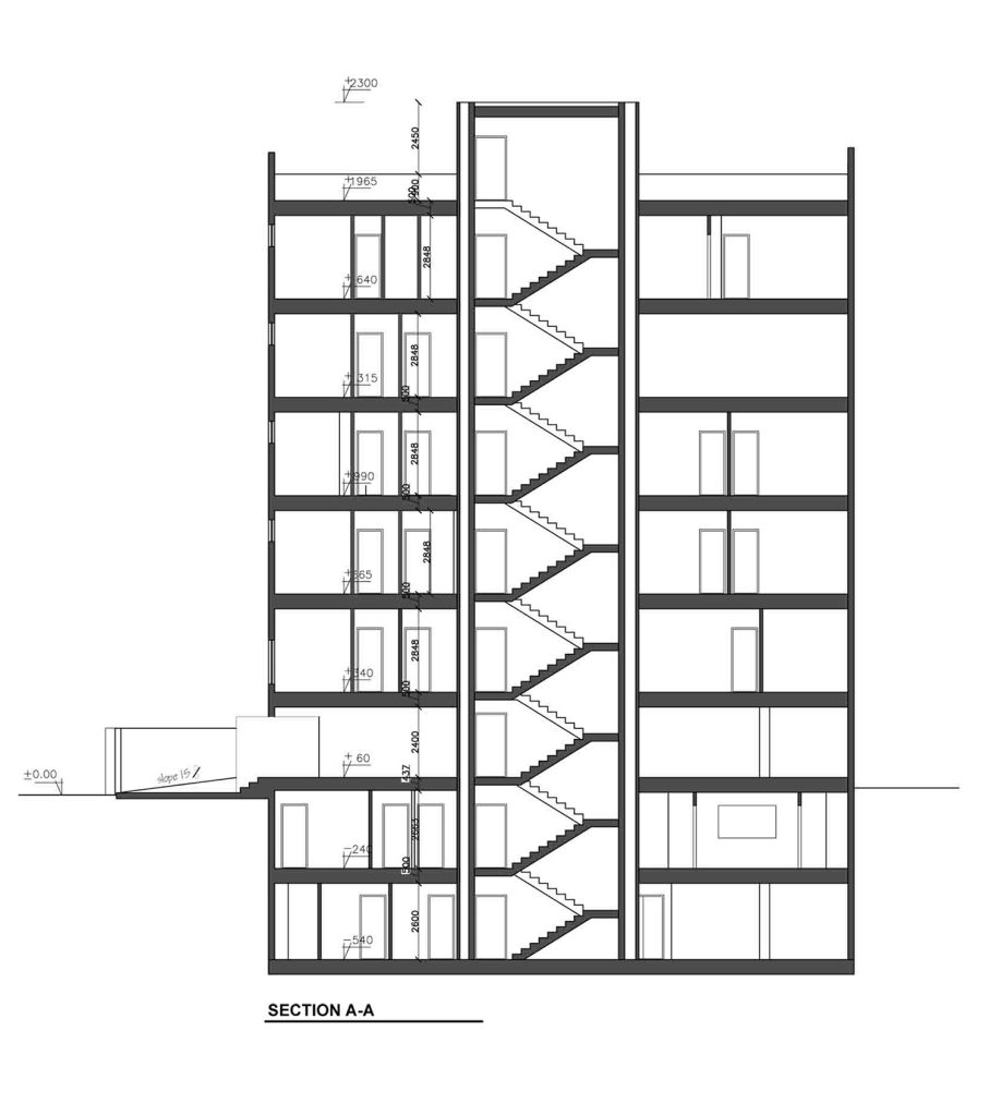
The Agah office building project came to our office in the skeleton phase. The employer’s intention was for his personal use as the headquarters of a market research company. The skeleton was made of metal on nine floors, and the client was no longer willing to change its construction. This urban block was located near the Hakim highway and could serve as an urban billboard. After visiting the site, we realized that the facade should be designed based on people’s quick perception while driving on the highway because the visibility and speed of pedestrians are meaningless for the perception of this building.
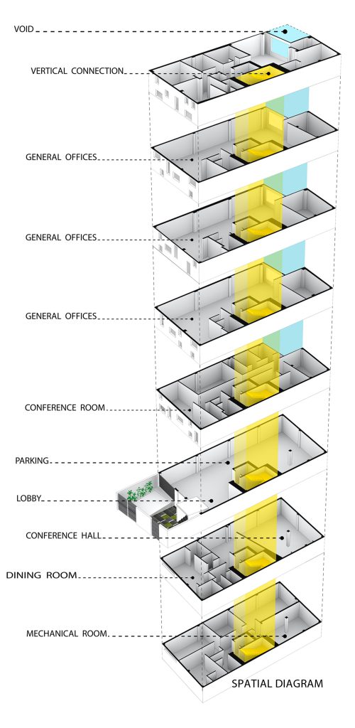
We also had to study the employer’s job to start the design. The client was the CEO of a market research company that conducts research on various customer products in the market, and their output for customers is always a number that includes the range of 0 to 9. So, their only communication with customers and the world around them is through numbers.
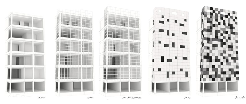
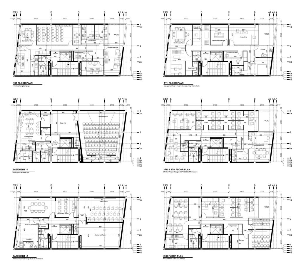
Also, at the same time, we started modularizing the facade and designed the modular grid. After achieving the detailed plans as per client needs, it was possible to determine the exact location of the windows. Each module that provided the light and view was considered empty surfaces (windows) and the rest as entire surfaces.
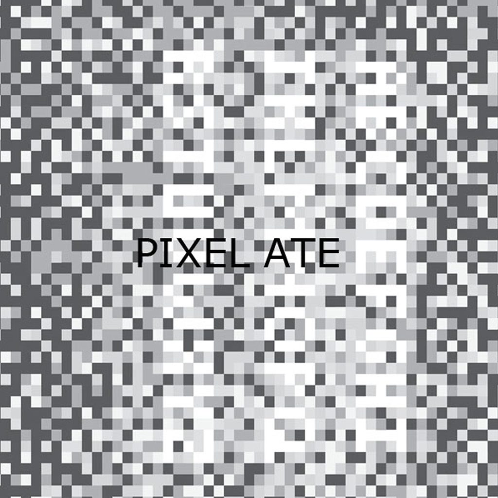
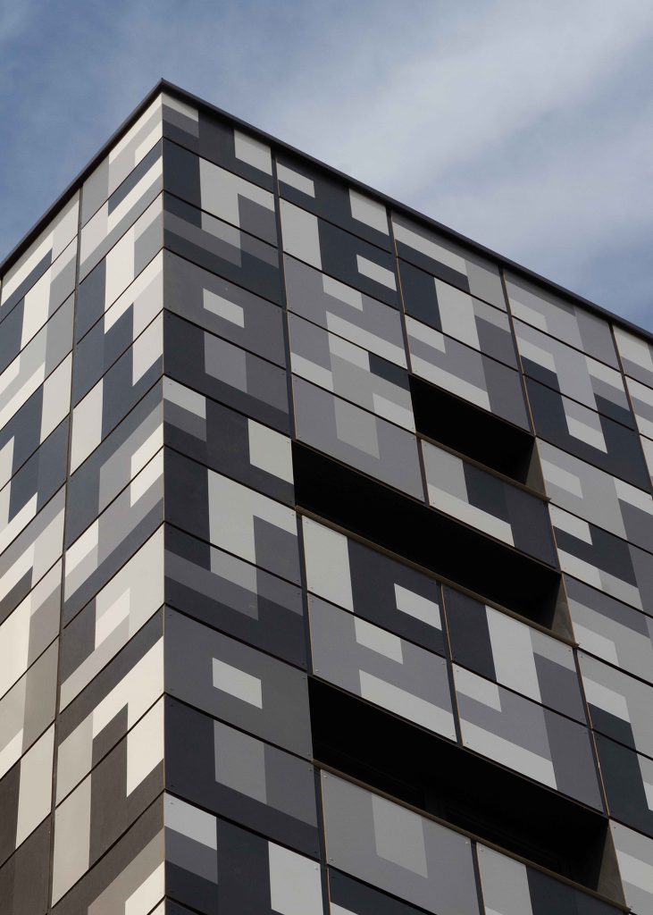
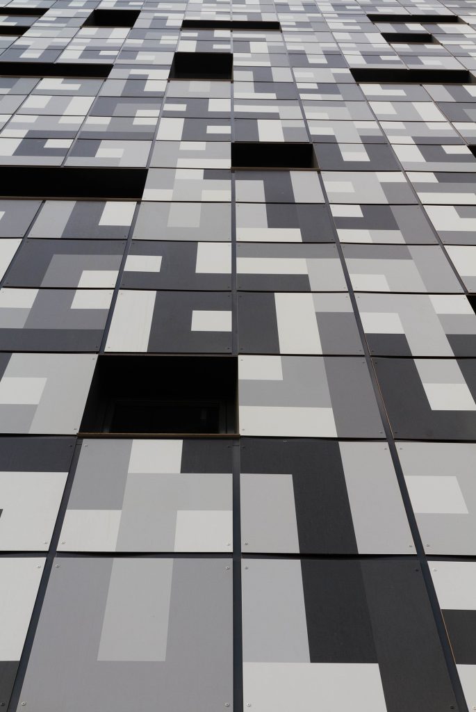
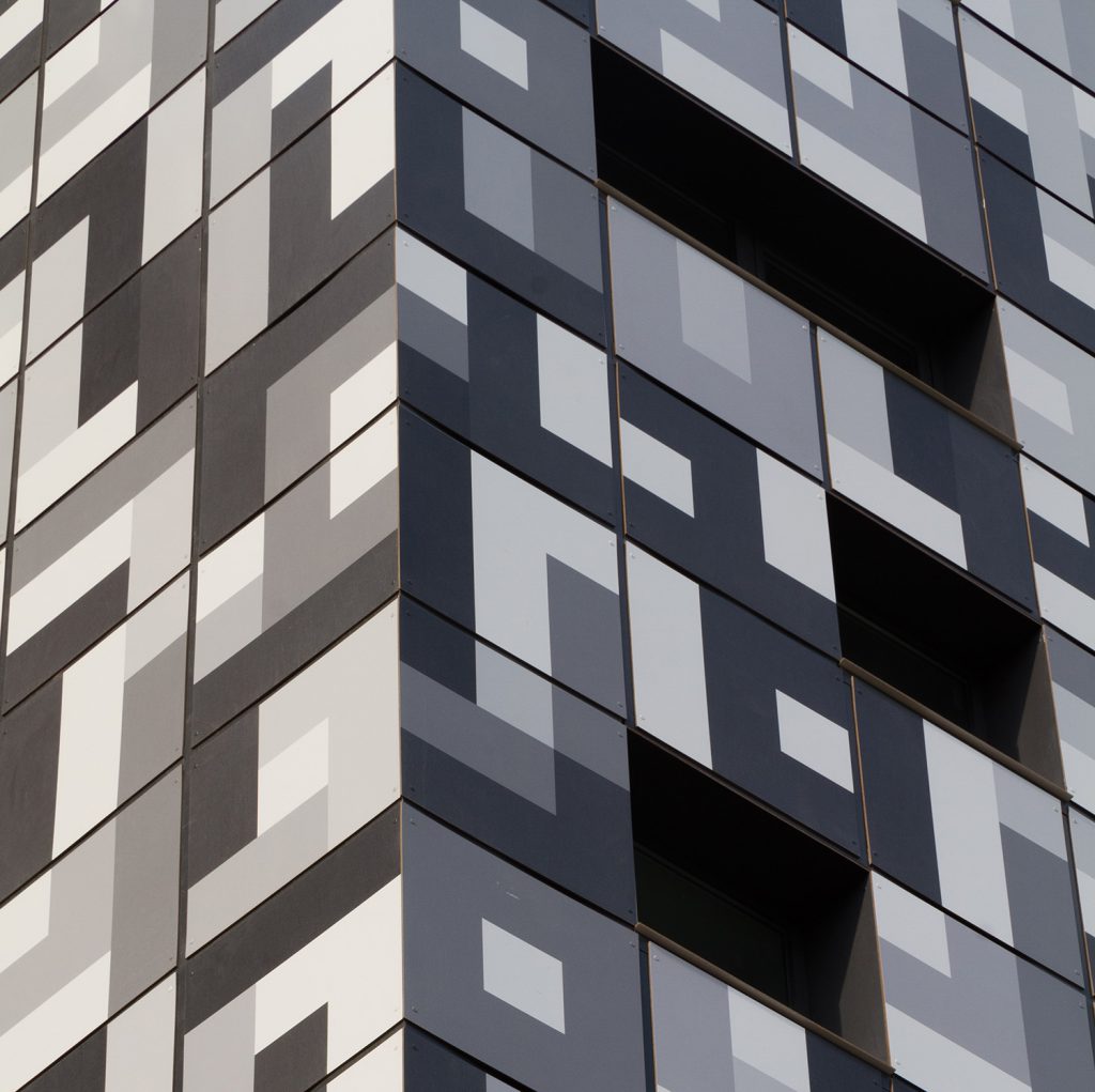
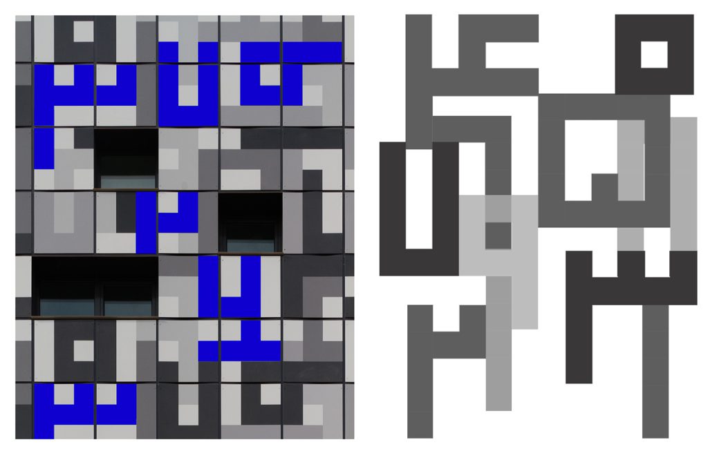
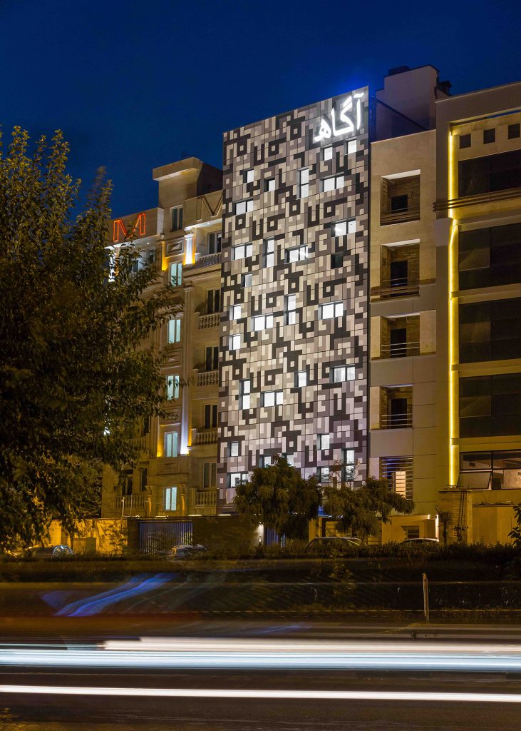
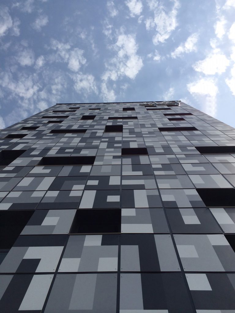
We finally concluded that due to the high speed of visitors and the electronic nature of the employer’s work, the best way is to write Persian numbers digitally. So at first glance, it is only considered digital, and with more precision, the numbers would be discovered. To make the view more attractive, the windows were also placed in monochromatic beads to give dimension to the façade as if citizens decode QR codes with their digital tools.
Because of the nearby highway traffic, the facade of this building and its lighting get more important at night. The general light of the building was provided by installing projectors on the edge of the wall. Due to the flatness of the facade, the squares and rectangles of the window are illuminated like digital cells. The conscious logo is also made with white plastic letters. Despite the contrast between the conscious building and its strange neighbors, our eyes are not strangers to it. Like all digital symbols, the eye quickly understands and passes over its geometry. The classic travertine tools and English neon letters of highway side views are more alien to our eyes.
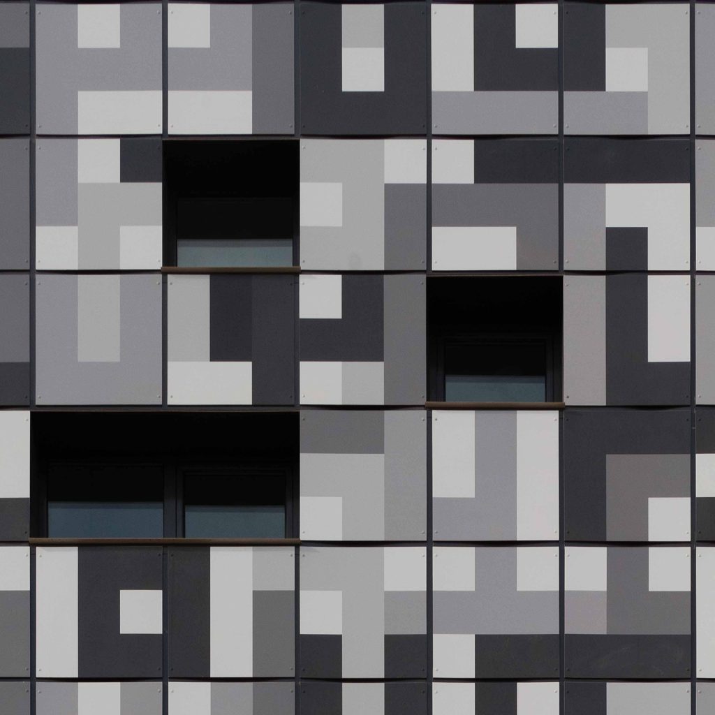
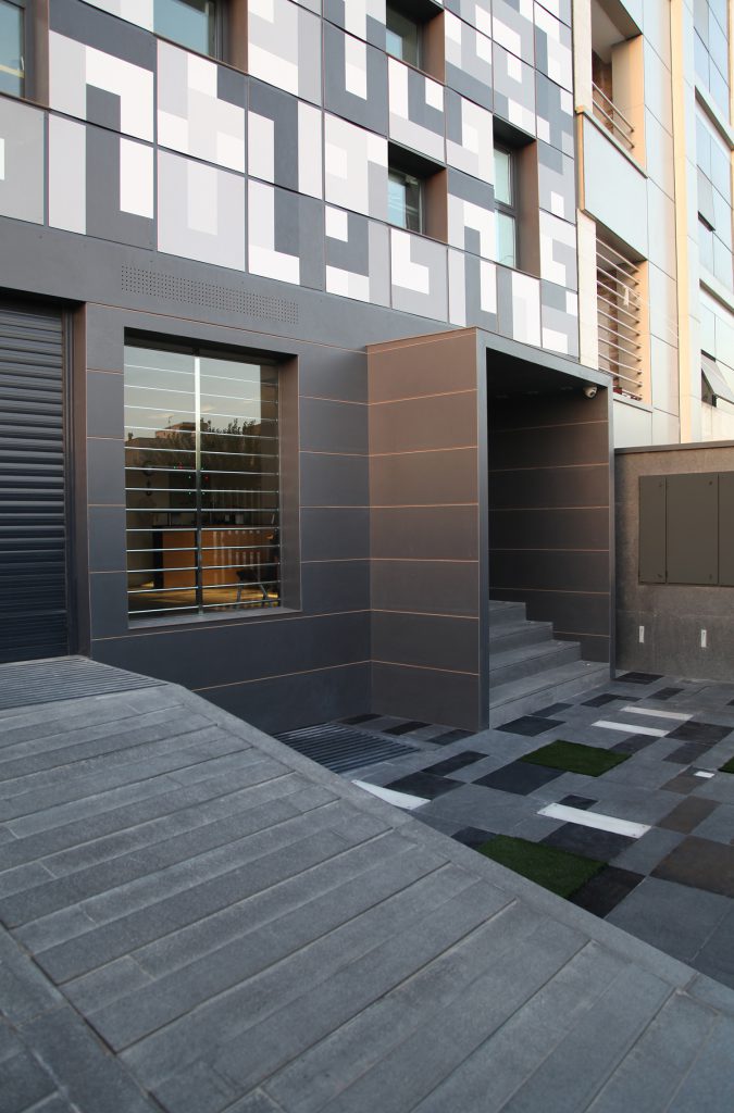
Persian numbers were first designed with pixelated graphics. Then we had to look for material that could implement the idea. On the other hand, there were only 5 centimeters of space to implement this idea. At this stage, we needed to find material that could provide a new language to express our vision minimally and precisely. For this purpose, we used HPL sheets to print our desired design on these sheets. Now we were facing new problems. This material was expensive, especially since it required many films and zincs. We also had to optimize the layout of the sheets and arrange the repetitions without destroying our integrated digital language. We created this distinction in the view following the color view. Even for the connections, rivets of the same color as the text have been used at every point. The advantage of the new material is its integrity because we could do everything from flashings and details to the return of windows with one material.

